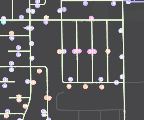
West Plains, Missouri is a town of over 12,000 people and is located about 20 miles north of the Missouri – Arkansas boarder. Their very capable GIS technician, decided to take the reigns...
Cleaning up the Waste with Optimized Routes!
Ever wonder if that route you run every day is the most efficient? Looking back, it all started when you found a map, grabbed your highlighter, marked it up and Voilà! From that day forth, your agency's routes were set in stone and they've been traveled over and over and over again ever since. You know that route like the back of your hand and of course its the most efficient because after all, you came up with it!
Well now with GIS tools such as ArcGIS Network Analyst for optimizing routes with the Vehicle Routing Problem Solver you may find that your old highlighted map is costing you lots of money in wasted fuel, time, and equipment ware. This post will take a brief look at the process optimizing routes for solid waste and recycle collection.
Step 1. Obtain point features for pickup locations
Garbage or recycle bins are located with GPS or geocoding methods and loaded into the GIS as point features to represent the various stops along routes. In this case the pickup locations were condensed to one point per street segment to allow for more efficient processing within the ArcGIS Desktop software.
Step 2. Generate Orders for Routing (condense if needed)
Creating optimized routes for thousands of pickups can take a considerable amount of time to process even with the latest hardware. For this example we used GP tools such as Create Route Event Layer and Generate Near Table to condense points along road segments and determine right or left side of street. This also allows for the pickup quantity field in the Orders class to be used as the number of cans along that side of the street. During this phase you will also place your 'depots' (starting and ending locations, including renewal locations such as landfills) on the map.
Step 3. Model Existing Collection Routes
By creating models of the existing collection routes within the GIS, we can confirm that variables such as travel times and service times are actually giving us "real-world" conditions and will provide credible results in our proposed routing models. Here we can see that the existing routes are very "block-like" and cleanly divided by neighborhood or subdivision. Looks pretty but not necessarily 'optimized'.
Step 4. Adjust Orders (pickup locations)
You may need to manually adjust some order locations and attributes as a result of modeling the existing routes to make sure the data is accurate and providing expected results with proper sequence of stops for the given route.
Step 5. Evaluate Various Scenarios and Select Optimized Routes
When processing the new routes, select various scenarios and compare those results to the existing routes to identify cost savings. For example, if the current collection program is running seven (7) trucks, try running a proposed model with only six (6) trucks and compare results. Cost saving measures are usually identified by total time or total distance. Once optimal routes have been selected, you will want to drive those routes as a quality assurance measure to be sure they are modeled accurately from the provided street network data.
Step 6. Using the Results
ArcGIS Network Analyst can generate turn-by-turn directions with detailed information on stops and estimated arrival and departure times. This information can be distributed to the drivers or entered into a GPS guidance applications such as Navigator for ArcGIS which will soon allow users to utilize their own pre-defined routes from ArcGIS Desktop or Online.
For more information or for a free quotation on optimizing routes for solid waste collection please contact Jon at 877-377-8124.
These Pop-ups are Making Me Thirsty: Embedding Related Attachments from ArcGIS Server in an ArcGIS Online Pop-up
In an ArGIS Online webmap, a user can click on a link within a pop-up window to view an attachment, or even embed an attachment stored in ArcGIS Online or in an outside photo-sharing site. But is there a way to embed related attachments (as a large batch) that reside on ArcGIS Server directly within the pop-up windows? We sought an answer to this question while creating a Utility Pole Viewer for the City of Sullivan, Illinois.
After some tinkering, we came up with a solution. There are a few twists and turns in the process, but nothing that suggests getting twisted up like a pretzel (or getting as angry as George Costanza).
First, you want to rename your feature class to [FeatureClassName]_working (or something to differentiate it from the original), and go about the process of enabling attachments on that feature class. Use the Generate Attachment Match Table and Add Attachments tools to populate the attachments in the related table. If you publish your service at this point and view the pop-up for this layer in an ArcGIS Online webmap, this is what you would see...
...just a link to the attachment.
Clicking that link opens up the attachment in a new browser tab:
That's OK, but we want to see the attachment in the pop-up. Lets take a closer look at the URL in the image above:
We determined that the group of digits between 0/ and /attachments refers to the OBJECTID of the feature class, and the group of digits after attachments/ is the ATTACHMENTID from the related table. However, fields from the related table are not available to choose when configuring the URL for the pop-up image in a webmap-so we need to get the ATTACHMENTID into the feature class attributes.
In ArcMap, join your feature class and the related table ([FeatureClassName_working__ATTACH) based on the Object GUID from the feature class and REL_GLOBALID from the table.
Export the feature class, but turn off all fields from the related table except ATTACHMENT ID and REL_GLOBALID. Give the file name the original name of the feature class. In ArcCatalog, create attachments on this feature class, and load data from the [FeatureClassName]_working__ATTACH table into [FeatureClassName]__ATTACH.
Back in ArcMap, add your feature class to an mxd and publish a mapping service.
Add the service to a new webmap, enable and configure the pop-up, and add an image under Pop-up Media.
In the Configure Image window, you can choose a field to use as a title (we used ATTACHMENTID), and add the URL where the attachment resides. To get this, copy and paste the URL from the browser tab that has the attachment, and change the digits between 0/ and /attachments to {OBJECTID} and the digits after attachments/ to {ATTACHMENTID}
The result: An attachment embedded within the pop-up window.
Zoom to your Room.
ArcGIS Online has released a new update for November.
Here is a list of what was expected.
Among them is a hidden gem that hardly got noticed or mentioned but will change the way we do GIS on the Collector App.
World Imagery, World Street Map, and World Topographic Map will be updated with additional levels of detail in the tiling scheme to support display of larger scale data in or on the basemap.
Did you see it? No neither did anyone at our office. That was until Paul stumbled upon it while using Collector this week during a data collection project. He kept zooming in and zooming in until all the valves were individually visible.
If you have never come across this, it's a BIG stumbling block for utility folks! Lots of these guys have oversized hands and clicking on a bunch of tiny dots can really get frustrating.
This is the difference from an ArcGIS Server Cache to the Esri imagery Basemap
In the past we have created a tile caches down to 1:500 for ArcGIS online (Or 1:250 if they have ArcGIS Server) this allows our clients to zoom in close enough to see the different features. Possibly click on several and hope the one they want got selected.
No More!
Esri updated Three Basemaps (4 if you count Labels) World Imagery, World Street Map, and World Topographic Map that now zoom-in to an unbelievable 1:71 !!! I cannot overstate how awesome this IS. Sure the imagery and maps are a little fuzzy but WHO-CARES at that scale you just want to be able to see the features separately.
If you look into this on ArcGIS Online web map, you can see that it's actually called "Room Level"
**Note if you Don't see this change on the Webmap interface, SAVE your map and try opening it again. AGO is a SAAS, but still needs to update the capabilities of the Webmap.
Now, get out there you large-handed-gorilla & Zoom-Zoom!
Is your GPS taking you the wrong way?
One day as I was working in my county engineer's office at Stark County, IL, a delivery driver stopped in and said "Why are these roads labeled incorrectly on my GPS map?" At first I blew it off thinking that's something beyond my control and I had more important things like ongoing construction projects. After all, we as the local agency were the knowledge experts on local names and places and if these big companies wanted our data they could "come and find us" with their "incorrect" GPS navigation devices. But then I realized what a tremendous benefit this would be to not only the local deliver driver but also emergency response, tourism, and many others.
So how do we get these basemaps updated? First of all, these basemap companies are BIG and there are only a few key players. By basemaps I mean the foundation for GPS navigation on consumer-grade electronics.
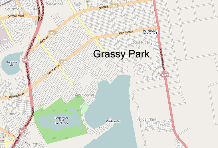
There's not exactly a 1-800 hotline that you can call as a one-stop-shop to update everyone in the universe (although that would be nice). There are however, tools that allow you to edit or update the information on your own. This is called crowd-sourcing, where anyone / anywhere can contribute to updating basemap information to benefit the traveling public. Here are some ways to do this for some of the bigger basemap providers out there:
A sample of an Esri basemap
- Esri Community Maps is a collaborative effort by Esri and the ArcGIS community to build the Living Atlas of the World
- Open Street Map is a crowd-sourced application that allows to edit and update street map information used by consumers around the world. All you need is to create a login and learn their simple editing tools.
- HERE, A Nokia Company, who recently purchased acquired Navteq is also a major provider of basemaps. With HERE you can go to their site:
https://mapcreator.here.com/mapcreator/ Map editing tool sign up for an account
https://content.ext.here.com/ Data upload portal (Upload GIS data here)
- Google Maps has a Base Map Partner Program that allows agencies to submit their data in vector format with specific instructions regarding format. In addition to vector data, Google also allows users to contribute to their collection of Cities in 3D, Imagery, and parcel data.
Remember, sometimes it takes some time for it to become active. Yes, real people typically look at the information you submit and actually take time to verify its accuracy.
If you have more ideas, thoughts, etc. please leave them in the comments below.
All Moved In (Guest Writer)
Below you'll find an article in our local paper from Journalist Cheryl Wolfe of the Pantagraph papers in Bloomington, Illinois. She did a fantastic job and we wanted to include her article in our blog as a "Thanks!".
(Reprinted with Permission)
ALL MOVED IN--Employees at Cloudpoint Geographic, Inc. are: (left to right) Jodi Hoffman, Paul Stephenson, Micah Williamson, Joe Christian, Matt Junker, Tyler Severson, and Jonathan Hodel
Cloudpoint Geographics moves to new office
Hodel plans open house
CHERYL WOLFE
cwolfe@mtco.com
ROANOKE—These days, Jon Hodel often has his head in the clouds and is always thinking higher.
When office space for his growing business, Cloudpoint Geographics, Inc. got too small, Hodel started looking for something bigger. He found it, just a block away in the building that formerly housed Dr. Michael Meier’s dental office.
A building with several smaller rooms might not fit the needs of most businesses, but for Hodel and his employees, it was literally a godsend.
“This office has been a perfect fit for us,” Hodel said of the building. “The Lord provided for us; we couldn’t have asked for a better fit.”
Hodel said it was getting crowded in his old office on Main Street, but now all employees have their own space, in addition to a conference room and a kitchenette. And, the move kept Hodel’s business in his hometown, just where he wants it to be. There was a time when Hodel was thinking of re-locating to another town because he could not get enough high speed Internet service in Roanoke, a service that is vital to his business. But he recently found a way to get by with the service in place.
“We don’t have fiber yet due to the cost, but we’re using the Amazon cloud, and we’re getting by for now,” Hodel said. “We have seen increased efficiency, and cost savings came into play.”
Most people don’t really understand the kind of work Hodel does unless they are very technologically savvy. Hodel is a licensed professional engineer and certified Geographic Information System (GIS) professional. His business started with him, by himself in an office with a laptop, and grew to where it is today with one part-time and five full-time employees. Their work includes GIS mapping for government utilities and public works and asset management, among other projects. Simply put, they make maps, Hodel said. But the maps are not simple.
GIS maps are detailed and made using satellite technology. They allow clients to visualize, question, analyze and interpret data to better understand patterns and trends, as well as what is happening in geographic space. They are also valuable in creating and maintaining more accurate records.
There is a growing interest and awareness of the economic value of GIS. It can be used to manage assets, such as the life expectancy of streetlights or to schedule garbage truck routes to maximize efficiency in fuel and labor. Cloudpoint performs both small jobs and big ones, like a utility mapping job in Mendota that has taken all summer.
These descriptions are only a fraction of the work that Cloudpoint is capable of doing, and they barely scratch the surface of what will be available in the future. Hodel said drones will be used as a powerful commercial tool in the future pinpointing a number of things, from agriculture applications to other commercial uses. He plans to be a part of that technology as it is implemented.
”We’re really excited about the new technology drones will bring,” Hodel said. “It’s fascinating. I really enjoy new things. It’s the engineer coming out in me.”
Hodel said he hopes to hire a licensed pilot to work with drones in the future to create another arm of his business.
The work of Cloudpoint Geographics is far above most of the public’s head, so getting his name out and helping others learn about the services he provides to gain new business is sometimes challenging.
“We find we do a lot of door knocking, and use our web presence,” Hodel said. “Most of our business comes from referrals or face-to-face marketing.”
Hodel wants to do a little face-to-face marketing with the people of Roanoke where he has lived most of his life. He has invited them to come see his new office during an Open House, on Friday, Oct. 2, from 4-6 p.m. He will be glad to explain some of the fascinating aspects of his work to anyone who is interested. And, he wants everyone to know how much he enjoys his new office in Roanoke.
“We’re really happy to be here,” Hodel said.
Illinois Roots for these Cowboys' Boots
Statue of Wild Bill Hickok in Mendota, IL.
Being lucky enough to be from the great state of Illinois and having a long lineage of ancestors who called the Prairie State home before me, I have a deep connection to the land and a pride of the heritage and history that the state embodies. While completing field work in the town of Mendota, IL, I noticed a large metal statue in the town square. Not ever being to the town before, I decided to go check it out. Upon inspection I learned that it was a bronze statue of James "Wild Bill" Hickok, a native of nearby Troy Grove, IL. This struck me as fantastic and I decided to dig deeper to see what other famous cowboys, lawmen, and sharpshooters were from Illinois.
I knew that the legendary lawman Wyatt Earp was born in and once called the Western Illinois town of Monmouth home, but I didn't know the vast connection of Wild West names that either were born in or spent time in the Land of Lincoln throughout the 1800's. Once i compiled a list of several men, I realized that I had to find a way to visualize my state's history that showed how interconnected it was to the vast frontiers and mountains of the American West. The best way for me to do that was by creating a story map via ESRI's ArcGIS Online story map builder.
You can view the map by clicking HERE. The process was relatively easy and pretty fun to put together. As you look at the map you will notice that the locations have one of three different colors for the tag: blue are for lawmen who once called Illinois home, red are for criminals that have ties to the state, and green is for a man of a completely unique professional background all his own.
DC by Map.
Two weeks ago we loaded up the family truckster and headed out on a 10 day 9 night camping vacation. No worries: we're campers, it's not a big deal to myself, my wife or my four kids to plan and enjoy 7 days sleeping in a tent.
What's different about this trip was the "urban-ness" of the campground. Greenbelt Park is a nice enough campground. The sites were fairly level, bathrooms tolerable, (see my Yelp review) water was cold and accessible. That's all an aside, what is important now is what I used to navigate from Greenbelt Park to downtown Washington DC and back and getting around while we were down there. Yes we planned on driving downtown, taking the Metro downtown from Greenbelt roundtrip for 6 people was $48.
For a few days I banged my head against the marble walls using Apple Maps and BestParking apps. too frustrating.
This was not a 'no tech' vacation. A flatlander in Washington DC trying to keep track of 4 younglings while searching for the best parking space or photogenic angle of any one of a dozen different memorials NEEDS a smartphone.
Navigation:
My Daughter figured out the interactive map in about 4 seconds. (pretty sure it's operations dashboard)
My first premonition should have been the LTE. Verizon LTE was spotty, Oh I had coverage, it just seemed to be bogged down. Lots of apps wouldn't work without LTE. Apple maps was one of them. Google Maps? Flawless on 3G. I should have switched then. Also Apple maps insisted that I make a U-turn about every other block, (without missing a turn). Their options are so limited it make me wish for my Garmin eTrex. You don't notice it when you are cruising around highways of Illinois or I-80, but in downtown DC in the height of bumper-to-bumper rush hour traffic, I cannot make a u-turn. Eventually for general navigation I chose Google maps over Apple maps & Waze. The 3-D view of Washington in Apple Maps was cool, but I still say 3D is not practical.
Parking:
The BestParking app never actually pointed me in the right direction, it puts a pin on the general side of the block. want directions? That's an in-app purchase. Also they seemed to advertise specials, or prices for hybrids or some such thing not daily or hourly prices. After a few stressful searches, I ended up using 'ParkMobile', an app advertised on DC's own parking meters. I could even "feed the meter" from the app*. Also just biting the bullet and paying for a parking garage helped too. To find the garage again, I usually marked the location with a star on my Google map app. Simplicity. Did I mention how bad traffic was?
Overall Needed DC apps
The National Park Service has a GREAT app that's a simple map with pins on it It's called 'National Mall'. I used that map several times each day, it was a life saver and a must-have for tourists. It has locations of main attractions as well as public bathrooms. Note: the National Aquarium has not been around for several years, but it's still on the map. Also on the one day that we took the Metro downtown the best app was the simplest. 'Metro Map' showed your location and the locations of the trains. That's all it did. No planner, no purchase of tickets just a simple map. Done. After that use logic and common sense. Of course when we did splurge and eat out, I used Yelp to find appropriately priced eateries for a family of 6. I also purchased the National Zoo app for $1.99 but that was mostly for Family Share so that my daughters could see the webcam of the Giant Panda cubs.
Lessons Learned.
The simpler the app the better. The Time & Navigation Exhibit in the Air & Space Museum was the best, but the t-shirt is $38. Parking on the street changes at rush hour. It's 2 miles from Lincoln to the Capital. The Potomac is kinda smelly. You can get soft-serve ice cream and $1 bottle waters from street vendors. The Archives charges twice as much for their copies of the Constitution as the Smithsonians. Parking tickets in DC are $100. Security guards in the Capital do not smile. Aaron Shock's office is still red. View from the steps of Lincoln is awesome. Meet Larry the volunteer at the National Zoo.
Because you can't fake accuracy...
You can fake your way through a lot of things in life. For example, you may be able to fool some folks into thinking you are a baseball expert by coaching a little league team. Make sure they know the steal sign, teach 'em to catch the ball, and not to swing at anything above their chin... and somehow everyone thinks you're some kind of pro.
So you don't necessarily have to be incredibly knowledgeable about the game or have pitched in the minor leagues to navigate your team through the season. But there are some things you can't fake, and one of them is GPS accuracy...
Like most GIS folks, you need a good quality GNSS receiver that connects to your mobile device via bluetooth? Most GIS folks don't need extreme sub-inch accuracy for their mapping project but they do want something that's better than the 8-10 feet they might see from their smartphone or tablet. Something in the middle like 3-4 feet would be nice (this area is shown to be a missing option as seen in this former post on GPS accuracy).
So let's take a look at some of the latest devices out there available in this realm...
The Trimble R1 GNSS receiver packs a lot of punch into such a small box. With Bluetooth capabilities for even more versatility.
1. Trimble R1 GNSS Receiver- a rugged, compact, lightweight GNSS receiver that provides professional-grade positioning information to any connected mobile device using Bluetooth® connectivity. Cost =. $2500
2. SXBlue II GNSS- The SXBlue II GNSS is a palm-sized receiver that delivers real-time, high accuracy performance using GPS/GLONASS satellites and free SBAS corrections. Cost = $2895.
3. EOS Positioning Systems Arrow Series 100 -The Arrow series 100 provides submeter accuracy for comparing with these other models but their line also includes the 200 model which claims to be the world’s first GNSS receiver able to provide 1cm real-time accuracy directly to your Android, iOS and Windows mobile device when connected to an RTK service or base station. Cost = $2995.
There are many different combinations and ways that you can collect high-accuracy GIS data with mobile devices. If you're looking for something that is lightweight and filled with performance, one of these units might be just what you are looking for. We hope to provide some more specific examples and possibly some accuracy reviews (nothing fake) in a future post.
To Portal? or not to Portal?
Last year Esri released Portal with ArcGIS Server as a free extension. There has been a fair amount of confusion surrounding the product. What is it? Should we install it? What is it?
One things is for sure; Esri keeps talking about Portal (or at least "a portal") so it must be important, right? Part of the confusion comes with issues of terminology. Another is people being unwilling or unable to explain the difference or what clients should do. I want to help with both.
If you're a Esri shop, ArcGIS Online (AGO) is the platform through which all your GIS will be pushed out to your customers and users. If it isn't now it will be, so go ahead and relent. That platform is a portal (lowercase 'P'). To induce this platform acceptance, Esri decided to giveaway the server-software that runs ArcGIS Online. That is ArcGIS Portal (Capital 'P'). So you're using a portal when you are using ArcGIS Online and you're using a portal when you are using ArcGIS Portal. Get it?
Now, Should you install and use ArcGIS Server Portal Extension? Probably not. Just use ArcGIS Online. Here's a quick Frequently Asked Questions when is comes to campaign ArcGIS Online (AGO) v. ArcGIS Portal (Portal)
Q: What about credits? STOP WHINING ABOUT CREDITS, THEY'RE CHEAP!
Q: What about Security? AGO is highly secure by default, probably more secure than your ArcGIS Server installation, which has No security by default BTW.
Q: Will AGO work with local services running behind my firewall? Yup.
Q: I don't like my data being hosted on AGO. So don't. the idea of a portal is a window, not a dropbox.
Q: Do I have complete control over my content? Yup.
Q: Can the Portal software run on my existing ArcGIS Server? Maybe, but it shouldn't. Are you asking to overload Your PrintServer/FileServer and make it an ArcGIS server too? Recommended Best Practice is to run it on a separate server by itself.
Q: Will AGO Work without the internet? Ok. Got me there, No. Your users do have to have access to the internet and most subdomains on arcgis.com. So you will have to whitelist a fair number of URLs. Whereas portal can completely be on your internal network. Sequestered.
Q: If I'm offline, how does Portal get updates to the basemaps? You install them.
Q: Then how about new tools that are release on ArcGIS Online? You Install those too.
Q: What about other peoples shared data outside my organization? No Workie.
Q: What if, I am using Portal and I want to upgrade my hardware to meet customer demands? You cancel your weekend plans.
Q: Seriously, What real benefit to I get from installing Portal? Your own Domain, Hyper-active-Internal-I.T.-Caveman-Security, Lots of extra work and a reason to spend lots of money on infrastructure hardware, bandwidth & overtime.
The security thing could be a genuine issue ... for like the Department of Defense. If you are in local government IT, it really isn't a deal breaker. Does Your server have Multi-Factor Authentication? ArcGIS Online is pretty seamless with ArcGIS Server and plus wouldn't you rather offload some of your bandwidth? In most cases (95%) with city/county government ArcGIS Online will most always meet the orginization's needs.
Not So Lite Anymore
For the first few years, ArcGIS Online was considered ArcGIS-Lite by many of us (including me). Pushing data to the cloud without the need for a server was indeed huge, but capabilities were often not. Even down to the lack of labeling, it was almost extremely basic in many respects. However, those of us who have been using and following the platform have been impressed by the gusto with which ESRI has pursued the enhancement of ArcGIS Online.
Over the last couple of years we’ve seen improvements across the board, from symbology to data storage, from basemaps to analytical capabilities. For instance, data collectors can now take data offline where internet access is limited and sync up when convenient. Or how about related tables - editing related records via the Collector app is finally here. FINALLY. And that’s not to mention the continued improvement to web application templates (there are 24 now, and that’s not including Web AppBuilder) that require zero coding to setup. Even the help documentation is pretty fantastic these days.
So there’s A LOT to be excited about in the world of ArcGIS Online. But right now I’d like to focus that excitement on spatial analysis. You know, that fun stuff that got so many of us intrigued by GIS, but so few of us utilize in the real world. Well ArcGIS Online has had improvements to that side of things to. So what kinds of situations would you find spatial analysis useful? Maybe you’re unfamiliar with the concepts, or maybe it’s just been a while. So here are a few examples:
Proximity and Site Selection
Displaying areas or features within a specified distance from main roads
Displaying areas or features within a specified distance from a flood plain
Finding location(s) within an area containing a certain threshold of elderly population
Finding location(s) within an area containing a certain threshold of young professionals
Where can food trucks station based on local rules and regulations
Combinations of any two or more sets of parameters or specs
Analyzing Patterns
Determining areas with a high or low density of grocery stores
High and low clustering (Hot Spot Analysis) of owner-occupied land parcels
These are just a very small sample of uses. Using GIS to perform analysis adds the visual component to the results, or an extra dimension in terms of data. It not only looks cool, it helps with comprehension!
Completely Fictitious Example Workflow
Let's say YourCity is interested in determining dimly-lit residential areas to allocate resources to. There have been a number of complaints and safety concerns, and now there is some funding available. So it is up to you as the GIS professional to assist using GIS as a tool to find and display the best areas to allot that funding.
In this case you are using zoning and streetlight information made available to you.
Step 1: Display Streetlights by Brightness Values
Symbols Sizes by Brightness and Classified by Natural Breaks
Step 2: Determine Residential Areas
Filter zoning layer to only display designated residential areas:
Step 3: Find Existing Locations
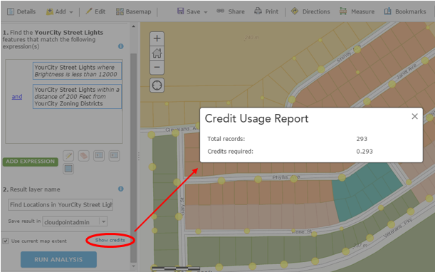
Use Find Existing Locations tool to determine where streetlights falling below a brightness threshold are near residential-zoned areas. This will use both an attribute query and a spatial query to produce a new layer meeting the specified criteria.
Step 4: Review Results
In this small, controlled area it is apparent and obvious where the targeted data fall. However in a larger area, it would be useful to further analyze these results to determine where clusters of dimly-lit areas are located. Those results could in turn aid in the decision making process regarding resource allocation.
Disclaimer: Two things you should always keep in mind - the quality and completeness of the input data, and choosing the appropriate boundary for your analysis, as changing the analysis extent will change your results.
Q: I have desktop. So why perform the analysis on ArcGIS Online? A: The same reasons that you use ArcGIS Online for anything – you can easily share the data through the web. You can dress it up in an application or presentation. And access it anywhere.
Q: What about service credits? A: No worries. First of all it’s not as bad as you might think. Second, you have a chance to see how many credits you will use before you pull the trigger. If it’s too much, you can back off or change your processing extent – but you’ll be surprised at how reasonable it is.
So there you go. Check it out, or ask someone who has. The spatial analysis capability with ArcGIS Online is here, it’s a great tool - and like the rest of the platform is constantly improving. Look for ways to answer your questions with GIS and add that spatial component that you can visualize and share.
Using ArcGIS Pro on a MacBook Pro
Pro on Pro (on Pro)
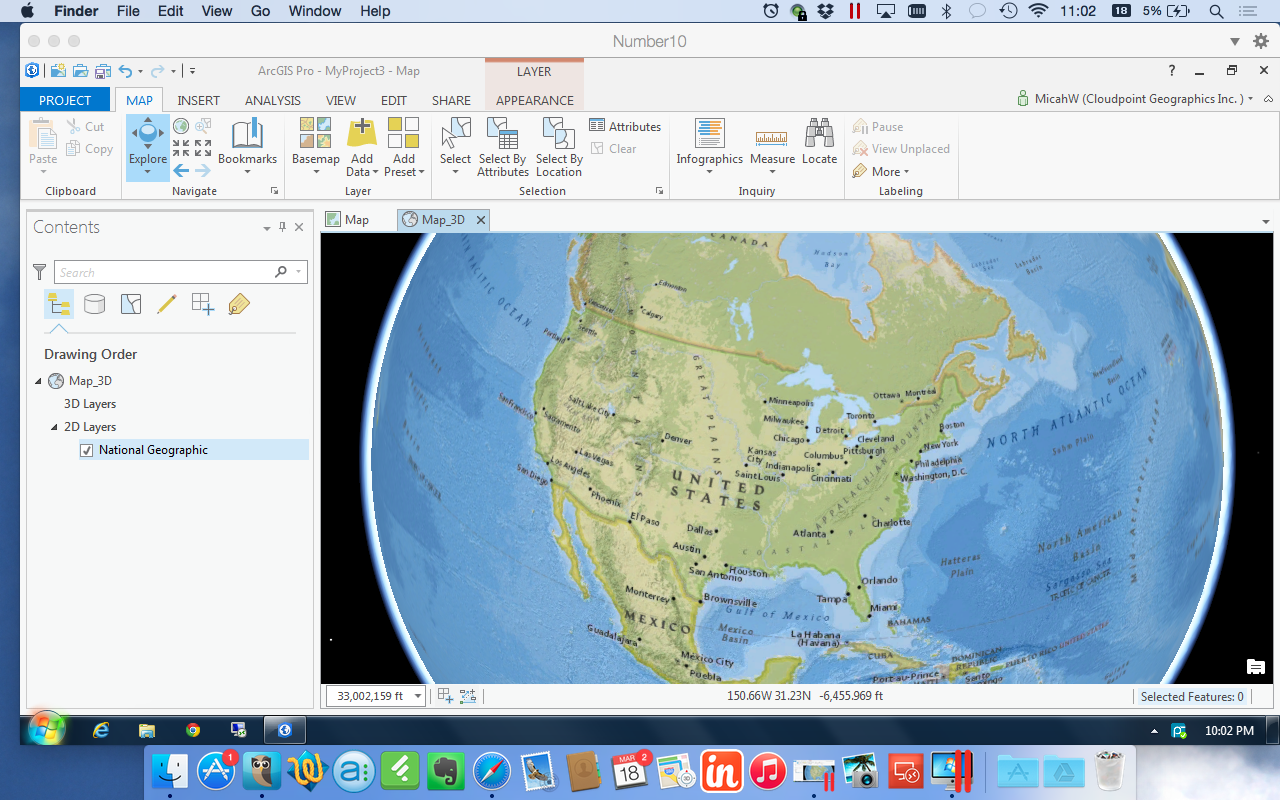
I've committed to learning Esri's ArcGIS Pro. Problem is, I use a Apple MacBook as my primary GIS machine and most software from Esri only runs on Windows. Up to this point, this is no big deal because ArcMap is 32-bit and not very memory intensive. It's been running on Parallels for Mac just fine for 2 1/2 years. Things change.
I had played with the Beta a while ago, and it didn't run too well on my current system. The display flickered & stuttered quite a lot and seemed to be constantly loading something. In anticipation for full release of ArcGIS Pro v1.0, I upgraded to the most current version of Parallels (10) and doubled my RAM to 16GB. Unfortunately, these easy answers didn't help with the display, I was still getting jumpy navigation and 3D felt like it was on Windows 2000. Great. Felt like i just blew $200 in upgrades. :-/
Last week during the Esri Business Partner Conference I spoke to a few virtualization experts who were demonstrating ArcGIS Pro on a virtual machine. (it seemed like they were there waiting just for me!) We spoke about my set up, there was a bit of nose-wrinkling but I looked around and pointed out about a dozen or so Macs throughout the Expo center. You have to do this when you talk about Esri software running on a Mac. Do I even need top point out how Apple was the only PC maker to have double digit growth in the past year? Point is there will be a lot of people trying to figure out how to run ArcGIS Pro on their MacBooks and the folks at the conference helped me out so I pass along that info to you:
Don't use open source virtualization. Virtual Box is nice if you aren't doing anything serious but doesn't have the options or horsepower that a production machine requires. VM Ware Fusion and Parallels are virtually identical in benchmark testing with ArcGIS Pro.
Do upgrade your RAM. I moved from 8 to 16 and dedicate a full 8 GB to my virtual machine. Parallels allows me do shave off another 2GB to the Video Memory still leaving 6 GB to run the MacBook.
Do use DirectX9 instead of 10. I know this is counterintuitive but the virtualization experts told me that ArcGIS Pro uses DirectX11 by default if it's available then jumps down to DirectX9. There is some compatibility issue with DirectX10. Parallels has options for OpenGL, DirectX10 and DirectX9. My video stuttering problems STOPPED when I chose DirectX9.
Do change ArcGIS Pro Display Options. Go ahead and monkey with the settings a little. Make sure your 3D accelerator matches your VM host. Enable Vertical Synchronization, and test the Speed --|-- Quality slider. I also set my system to delete the cache after I close the project.
Do use a host machine with a Nvidia Graphics card. MacBooks with Retina displays usually have one of these but you can check to make sure. Unfortunately, I do not. Download the 'Clear Sailing' Nvidia demo to test your system.
Final Notes:
Every system is a bit different. ArcGIS Pro is programmed to use a GPU if it's available. My Expert friends inform me that VMware Fusion leverages the GPU for 3D acceleration, but does not support GPU true pass-through. Parallels tries to create a virtual GPU by assigning RAM directly to 3D acceleration but it's not a direct GPU either. Look for this technology to keep advancing. I an a firm believer in SSD drives. I have two right now, one is completely for the Windows VM.
Disc Golf
This started out as a simple smartphone GPS(GPX) trace. A trace to follow the route through a local course, which I could later add to my own map. Of course that map had to include the beginning and ending for each hole – tees and baskets. Nice! And easy! …Hmmm maybe way too easy. Decided to digitize the surroundings in ArcGIS for Desktop to really make the course stand out. Some of the data was available, but most of it did not meet the quality standards I was after – so I ended up becoming super-efficient at a variety of digitizing techniques instead. Note: I did and still do turn to Google Maps for reference in their top-gun imagery. In your face, everyone else’s imagery.
The first result was not bad, and caught the attention of the right people at the right time. It just so happened that a prominent local tournament could use such mapping for a few area courses. Sweet.
The first course, fairly refined. Washington Park, Washington IL
It's been great so far. Courses are a nice size for weekend projects, and contain a good variety of features to work with. Oddly enough, what I consider the biggest challenge to date has been depicting trees. When canopy is sparse, you can drop points to represent trees and shrubs, but that gets to be tedious rather quickly. And finding the best way to get those points to display at a quasi-relative circumference can also be WMTTD (Way More Tedious Than Desired). Other options used include tracing the boundary of thick canopy areas or my favorite, extracting them from DSM (takes a billion mouse-clicks off your finger, but you still spend enough trial and error time finding that perfect set of values that your default gdb looks like its ten years old).
Sneak peak of the temporary course at Eureka Lake Park, Eureka IL
No matter what methods have been used, a number of new tricks were picked up along the way that fulfilled certain needs and have made for easier going moving forward (hooray GIS). This has been a great example of utilizing the technology for a practical use while coupling it with an enjoyable pastime. Not to mention it will help in a small way to contribute to both the disc golf and local communities. Win-Win.
ArcGIS Pro Demo-nado
OK. The GIS World has had the much anticipated ArcGIS Pro for about 3 months now, and everyone is still using ArcMap. Why? Because change is hard.
Geo-Professionals should really change that, because ArcPro, Pro, ArcGIS Pro, AGP whatever-we-call-it is actually a pretty good product. YES, it has some shortcomings, as most first versions do. However, in a very unofficial tally from a group of 12 GIS professionals, the good outweighed the bad 8-5. Not a blowout be any means, but a positive result nonetheless.
It's no surprise that we (Cloudpoint) are behind the product. Ok, I am. I recently doubled my RAM in may MacBook in-part to be able to devote more speed to Parallels to run ArcPro. It runs well too! Drawing does slightly stutter when in 3D but that doesn't matter because I have yet to be convinced that my clients want or need 3D GIS.
I digress. This morning I created the two videos below in order to demonstrate ArcGIS Pro and several of it's best qualities (not 3D). The videos are fast paced, packed full and I kept them between 6 & 7 minutes. This is not GIS training, you can't train any person GIS in 7 minutes, let alone on a new piece of software. I hope you enjoy them and then download your copy of Pro to try it out.
In this first video of a two-part series, We simply walk around the interface and perform some SIMPLE actions. Opening a Map, Editing map notes and understanding what happens.
In this Second video of a two-part series, we will talk about importing an ArcMap MXD, Editing and touch briefly on navigating layouts.
Please leave a comment on YouTube if you like it.
Live Maps inside a presentation using Bunkr
If you have an ArcGIS Organizational account, you already have license to use Esri Maps for Office. It works really well and enhances your presentation from the boring screenshots of maps we have all grown numb to.
BUT! What if you don't have Microsoft Office? (there are a few of us) Or you use a MacBook or ChromeBook or UbuntuBook(?). Never fear, You can still embed your maps into a presentation using the Newly improved Bunkr App.
Bunkr has been around for a few years. However, they very recently Re-built themselves from the ground up. The streamlined tools and formatting will not appeal to those who are heavy powerpoint wingding/clipart/rainbow-font graphic users. It's a very minimalistic design. Which I respect, because presentations should focus on what the presenter is saying and slides should reinforce what is being spoken. Infact, I uploaded on of our graphic-heavy canned presentations and Bunkr essentially imported them as jpegs.
Instead, Bunkr focuses on web-data; stuff already on the web. Yes, it's cloud-based. No, you cannot download a presentation. No, there is not animation. Deal with it. You can however pull in Google Drive, Dropbox files, Instagram feeds, Pintrest boards, YouTube Videos, Grooveshark Playlists, Time/BBC/TechCrunch/Wikipedia Articles, images from anywhere, Code from Codepen ... and on... and on. Seriously, the current list is about 75 different online services and the application is still in beta. (You can open and read PDFs!)
Get to the Maps man!
At first I was excited to see the ability to embed code. That way I knew at least I could share a CodePen and display the results. I've played with that service before. Using it to keep, test and maintain good iFrames of embedded maps from our ArcGIS Online. In the example Bunkr presentation below, the first map is this CodePen. It works ~fine~ and the display isn't 'horrible'. Still, it is using another service to 'host' your iFrame, so there is some funkiness there, not everything displays exactly like you want.
Then I Learned that to display the Google Drive document, Bunkr requests the iFrame code directly. So, I tried the next logical step and inserted the whole code snippet from my shared ArcGIS Online map. BOOM! Complete slippy map in a presentation format. Here is the presentation to truly understand what I mean.
The only downside is that the code snippet is gone. You can't make those slight edits or adjustments on frame size. Once it's pasted and the slide is created, there's no editing. You just create a new slide and re-paste. So, I'll probably keep a list of embeddable iFrame code snippets somewhere, like I do now.
Awful presentations are usually the cause of fatigue and skipping out early on work. Engage your Audience with interactive maps.
You might be saying: "Seems like a lot of work to just display a ArcGIS Online map. Why not just link it to Your Powerpoint?" Well that's a valid point. However, if you want a smooth presentation and the ability to easily pull in MANY different sources from around the web, sometimes switching back & forth from Chrome to Powerpoint to Crome again gets tiring for the viewer. You've seen (or YOU have presented) those kind of maps, the presentation is constantly switching from browser to Powerpoint. And if the screen resolution is extended and they have to draa-aag the browser onto the correct screen, then eventually the presenter gives up and doesn't go back to presenter mode and just stays on the editing view.... ugh. you know what I mean? disconnected and confusing presentations are poor presentations.
That's really what makes presentations awful: Presenters don't often enough think about the audience.
A Look Forward: No Predictions, Only Productivity
Don't fall into the trap of thinking you know anything about the future. Sure, There's lots of neat confucus-iy quotes about knowing the future from learning about the past, or whatever. I've succumbed to the temptation myself to guess what will happen in the next 5 years. Here's the real deal. You can only control the "now". Even then just a little tiny corner of your world. The future is ever changing, take a lesson from Yoda.
Here at Cloudpoint, we are developing Principals to work by and not procedures or policies. We have no employee handbook or workplace guidelines. Even if we did it would be filled with bullet-point list of adages. For Example:
Be Professional.
Work Hard & Be Nice To People.
Are you Productive or Just Being busy?
Make it Better.
Why are you here?
When the door is shut, don't bother me.
Never Stop asking Questions.
When you feel like you can (or try to) predict the future, your pride gets in the way of actually making it happen. Somewhere inside you become a spectator watching life rather than a participant in it: "I knew this was going to happen!" Not helpful. A bit of personal humility can go a long way when you are assisting people with a new technology. Rather, when you set attainable goals you set a standard for yourself, a personal guideline. American author Mark Batterson once said (paraphrased): 'Goals are Just Dreams with Timelines' Well Said, Everybody needs dreams.
This is what 2015 looks like for us. These are our genericized Goals:
Increase Benefits to Team Members
Expand our Territory
Hire
7+ Speaking Engagements
Learn New Software
Read 13+ Books
Freely Distribute Several Useful tools
Centralize Cloud Offerings
There are others that I'm not willing to share, but this is most of the list from our first 2015 staff meeting. Some of them are personal, some are corporate all are real and attainable.
Don't let the lure of trying to predict the future fill you with apathy and pride.
What are your goals?
A look back: Cloudpoint's 2014 Year in Review
First Flight: We've come a long way from Kitty Hawk, NC
First flight of the Wright Flyer I, December 17, 1903, Orville piloting, Wilbur running at wingtip. http://en.wikipedia.org/wiki/Wright_brothers
A close up of one of the props on Cloudpoint's first quadcopter which was later dubbed "Icarus".
It's been over 111 years since the birth of powered aviation and its amazing to think of where we've gone. Cloudpoint conducted its first successful GPS-guided aerial mapping test flight on June 9, 2014 at the Roanoke Apostolic Christian cemetery. Height: 150 ft, Speed: 6 mph, Flight time: 8 minutes
Mapping at Sonic Speed
Cloudpoint's new Chevy Sonic with almost the whole crew loaded inside.
In July we purchased our first company vehicle, a Chevy Sonic, from Sam Leman in Eureka, IL. The logo and lettering by Kat-n-Mouse Graphics of Roanoke. This has been a great vehicle for us as we put many miles on traveling throughout the state to our various clients.
Signs of Success
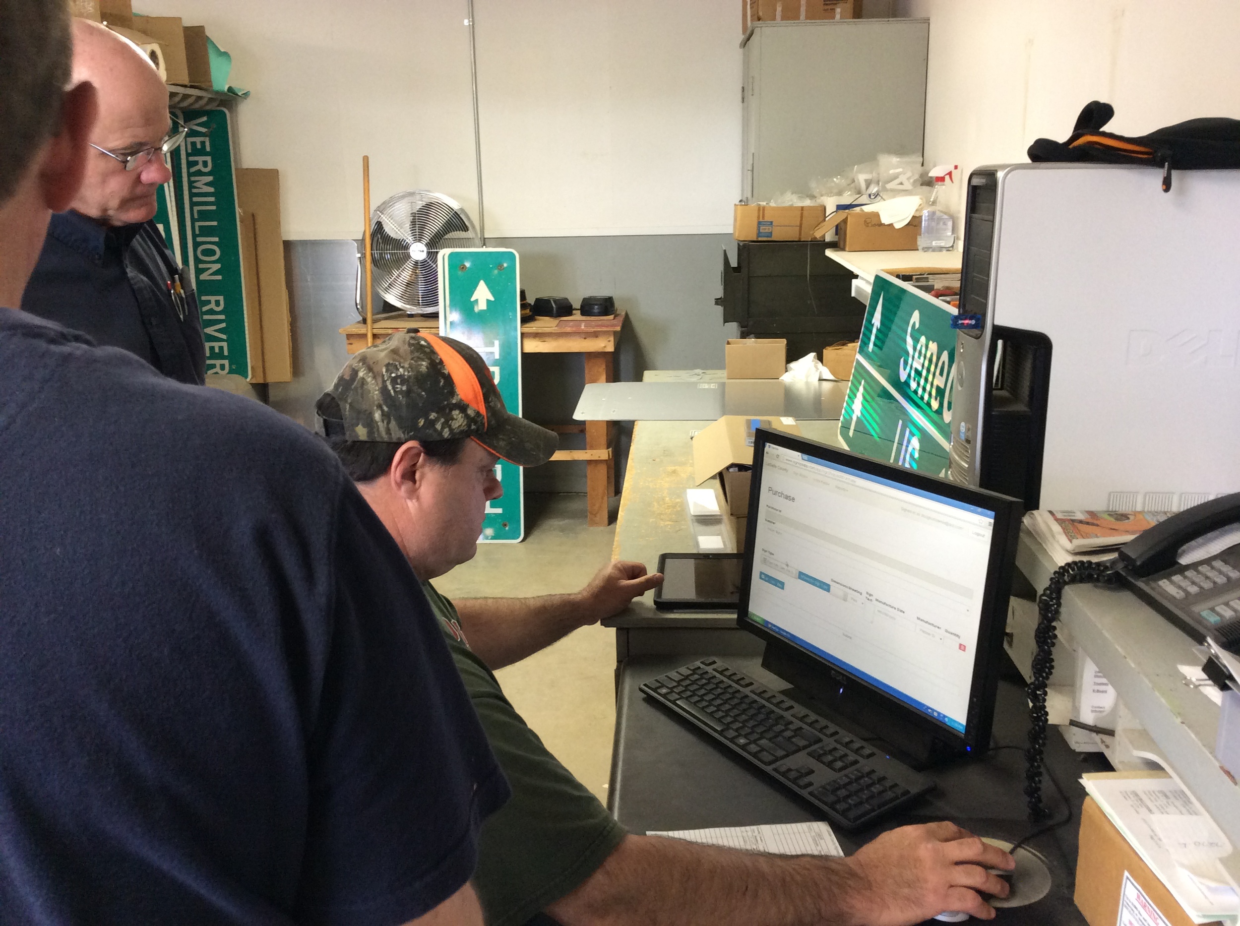
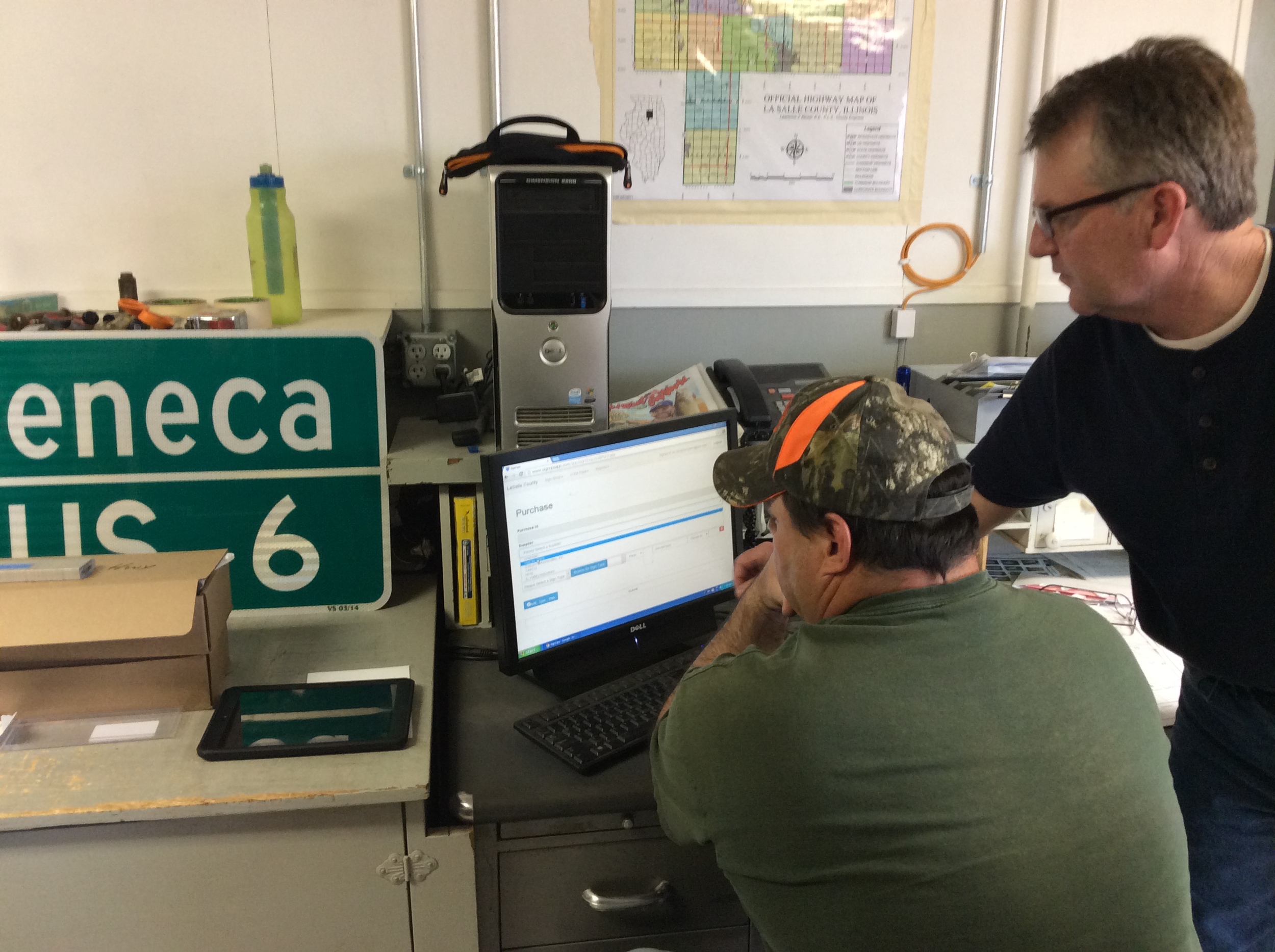
On May 1 we successfully rolled out our first custom application solution called SignOps, a sign inventory management solution using barcode tags for asset management. LaSalle County was the first project where we tagged over 6,000 signs with barcodes and provided a complete turn-key mangement solution with the SignOps application.
5 Christmas Gift ideas for the Geogeek in your life.
I admit, this is quite the "Wish List" from your rich Uncle Montague. But they're neat to dream about and hope for someday.
In no particular order.
1. Land Carpet.
Who doesn't want to stretch out on a map? Because paper is not really inviting, how about a map made out of genuine New Zealand wool? (did you know there are 7x more sheep in New Zealand than people?) Awesome. However at $2100 for a 6'x8' area rug, it's not for the typical GIS Technician's budget. Something a little more reasonable is the I Am Here Custom play-mat
2. Map Wheel
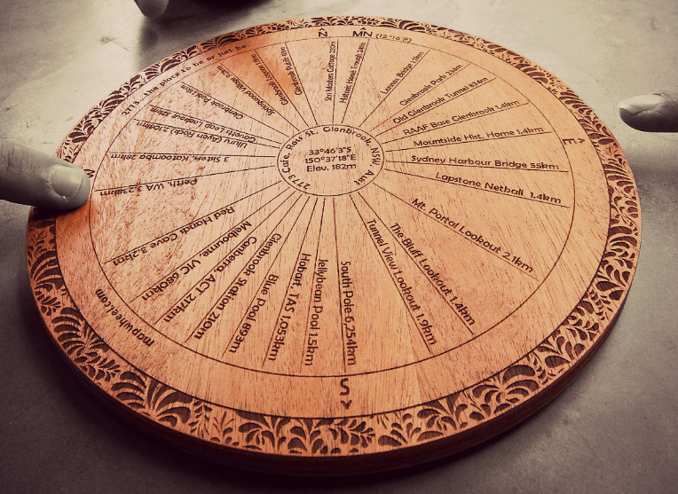
I know where I am, most of the time. The Map Wheel is a distinct custom made reminder of where that other place is in reference to wherever I call home, or whatever location you choose to be in the center. Kind of like the Direction Pole in the TV show MASH. A custom Map Wheel is about $100 US with about $10 shipping, but it's made in Australia.... soooo, it might have to be a Valentines Day present.
3. World Map iPhone Case
Easy. $30. Wood. Looks nice. Made in Indiana by a guy named John, how American is that? Boom. Get it. Only for 4/4s & 5/5s. No iPhone 6 or 6+ yet.
4. Fitbit Surge
I like GPS & I am a watch wearer, but I'm not holding out for a Apple Watch. They look cool, but I don't have that kind of cash. Plus there are literally dozens of other smart/fitness/GPS/bluetooth watches on the market. I like a rectangle design and the Surge price tag of $250.
5. Hand Made Globe
uh. I've tweeted about these before, and actually gotten a response from the folks at Bellerby & Co. These are amazing - beautiful - works of art made with care, precision and an obvious personal touch. My wife would grab her Scrapbooks running out the door in case of a home fire, I would grab this globe. Especially since the desktop version is about $1700 US. Save your pennies kids! Someday. Someday.
There you go. 5 rather unrealistic and completely unnecessary first-world presents to get for your resident geographer to celebrate Christmas.
Got any other Ideas? Put them in the comments.
The Machine that Goes 'Bing'!
Centimeter Topo from 400 Feet
It is hard to deny that UAV technology is not going to impact many industries. With the lack of FAA regulation keeping commercial use grounded, gaining experience is hard. In an effort to test and develop our UAV imaging portfolio Cloudpoint Geographics has developed a solutions package.
Cloudpoint is striving to bring affordable imagery to industries such as mining, agriculture, engineering, and undiscovered markets. The value of affordable imagery that can be flown daily can help decision makers perform tasks by giving them tools to conduct stock pile volume calculations, topographic surveys, crop analysis, and many other needs. Cloudpoint's history as a geospatial solution provider allows us to use advance GIS and image mosaicing software to generate 3D deliverables.
How We Do It!!
Creating such results comes from combining various technologies to create a package. UAV's are just the flying platform and must be assisted by ground control, a good camera, and powerful processing software. Software algorithms, such as Agisoft Photoscan, are used to stitch photos to make a large mosaic as well as calculate elevations. This 3D model then can be exported as a point cloud, DEM, or one of many other formats. The imagery and 3D models created from images can then be used for many tasks such as volume calculations and Topographic modeling.
Real world Uses
- Daily Stockpile Volume Calculations
- Better Imagery for any situation
- 3D Building extraction
- DEM or Topo creation


